In a previous post I got all carried away with the
phenomenon of whisky reviews; and by that I mean the way people dissect the
flavour and scent of whisky and separate it into constituent parts – vanilla,
cloves, red berries etc. If you didn’t see that post, you can have a shuffty
here (it was only last week), or if you can’t be bothered with that, here’s a particularly
evocative example from the Caol Ila website.
CAOL ILA 18 YEAR OLD
Age introduces a golden colour
and complexity to this mellow, amber Caol Ila. It starts smoky-sweet on the
nose then drinks smoothly, showing a sweet yet sour character. The long-lived
finish evokes a distant, smouldering beach bonfire.
NOSE
Smoky bonfires, then soapy water and wet wool, with a
smouldering beach bonfire in the distance. Hints of mineral oil, then wax.
Develops scents of burnt pork sausages.
That one’s not actually that bad; it keeps the flavours
listed to a minimum, and instead goes for more of a description, but still; you
can see the sort of thing I’m getting at.
When I was writing the post, I was also ensconced in a book
that you may have seen me make mention of a good few times already: Ian
Buxton’s 101 Whiskies to Try Before You Die. I remarked on how his
reviews classify the colour of the whisky as well as the scents and
flavours. So I thought it would be nice to follow up What is it with whisky
reviews? by delving a little deeper into that.
.jpg) |
| colour charts |
I am well aware, as I’m sure you are, that the colour of
whisky can vary quite widely (within certain parameters – I mean, it’s never
going to be green, is it?). What confuses me is how someone could look at one
whisky, and say ‘that’s golden amber’, then look at another one and say,
‘that’s amber gold’.
.jpg)
.jpg) Sure, the colour of some whiskies differ greatly from
others, but it is also true that some are quite similarly coloured. ‘How does
he do it?’ I asked myself. “Does he have a Dulux colour chart or what?”
Sure, the colour of some whiskies differ greatly from
others, but it is also true that some are quite similarly coloured. ‘How does
he do it?’ I asked myself. “Does he have a Dulux colour chart or what?”  And thusly was an idea born. The next time I had a reason to
go to B&Q (purchasing a blueberry bush for my sister’s housewarming
present), I stopped by the paint aisle and collected all the colour cards that
might represent the colour of whisky. These aren’t standard Dulux colours that
you can buy in tins, but the ones you can have the staff mix up for you, and
there were quite a serious number that might correspond to the colour of
whisky. I ended up collecting 17 cards. Some were classed as yellows and some
as reds. Oddly, the ones that were classed as gold weren’t anywhere near the
colour of whisky. I say oddly because Buxton’s book has a good number of
the whiskies classed as some form of gold or other. I stashed the cards in the
pouch of my hoody, and took them home where they now sit in my booze cupboard
awaiting any occasion I pour a glass of whisky.
And thusly was an idea born. The next time I had a reason to
go to B&Q (purchasing a blueberry bush for my sister’s housewarming
present), I stopped by the paint aisle and collected all the colour cards that
might represent the colour of whisky. These aren’t standard Dulux colours that
you can buy in tins, but the ones you can have the staff mix up for you, and
there were quite a serious number that might correspond to the colour of
whisky. I ended up collecting 17 cards. Some were classed as yellows and some
as reds. Oddly, the ones that were classed as gold weren’t anywhere near the
colour of whisky. I say oddly because Buxton’s book has a good number of
the whiskies classed as some form of gold or other. I stashed the cards in the
pouch of my hoody, and took them home where they now sit in my booze cupboard
awaiting any occasion I pour a glass of whisky.
I’ve never really found those B&Q colour swatches
useful. Just as I find it impossible to taste a drink and say, “this tastes of
cloves, fresh mown grass and mussels”, I have an inability to look at a 6.1 x
2.8cm block of colour and apply it mentally to a whole room. In addition to
that, I’d contend that the paint looks a different colour on your walls
than it does on the sample.
Nevertheless, I thought it would be fun to apply an actual
guide to help with classification. If I can also determine what the Dulux
classification is for some whiskies that appear in the book; that will be great
– of course it will ultimately be pointless, but nevertheless great. And maybe one
day I can paint a room the same colour as one of my favourite whiskies, and
maybe that will be all relaxing, and when I drink a glass of that whisky, I
might feel like I’m swimming in it.
Actually, a few years ago, [I think it was] B&Q [who] ran
an advertising campaign, the gist of which was that if you found a colour you
wanted, you could take a sample of it, and they would mix up a paint of that
colour for you. In one such advert, a woman liked the colour of a man’s hoody,
and cut a chunk off of it with a pair of scissors. By that token, how cool
would it be to take a bottle of whisky into B&Q, pour a glass, and say, “I
want a paint in this colour”?
Now, in case you don’t already know, the recommended
practice for appraising colour is to pour a glass, and then gaze at it against
a white background. Until I read the 101 whiskies book, I hadn’t realised the
point was that you could then try to decide what colour it was. I thought it
was just so you could go, “that looks nice”. It always looks nice.
My first experiment was with the Dewar’s 12 Years Old,
double aged that I picked up in Ibiza Airport’s Duty Free shop. I saw the other
week that you can get 70cl in Sainsburys for the same price that I paid for a
litre there. That seems to be how Duty Free works, in the main; 30cl extra
free. It’s just a shame that sometimes you don’t want the extra. I’ll be a
little more careful in Duty Free next time.
I poured a generous glass, held it up to my kitchen cupboard
and cycled through my various colour cards, attempting to see which one matched
most closely.
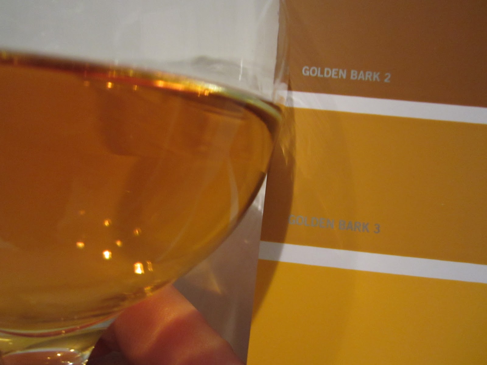 |
| Dewar's 12 yo, golden bark 3 |
I was initially a little sceptical that I would find any
exact match, but I think I did fairly well. I may not be quite on the money,
but I think its close enough. Take a look at the picture, and see for yourself.
So Dewar’s 12 Years Old, Double Aged is Golden Bark 3. I can’t compare
this one to the Dewar’s in the book, because I got the wrong Dewar’s. The one
in the book is “Special Reserve”. Oh well.
While I’m on it, I may as well give you a brief first
impression of the Double Aged Dewar’s; I was impressed at first. You know that
I don’t know how to describe flavours, but my first reaction was, “oh yes,
that’s a classy taste”, but then the familiar blended scotch taste took
over (must be the grain), and each succeeding sip was an attempt to repeat the
experience of the first sip – mostly unsuccessfully. It seems I had become
desensitised to it already. If that’s the way it stays, it looks like being a
frustrating whisky. Time will tell. And then it will probably tell all over
again. Litre frickin’ bottle, I don’t know.
 |
| Grant's, sulphur springs 3 |
I moved on, and was able to try a swatch test with my bottle
of Grants’ just before I finished it. It’s a good deal lighter in colour than
the Dewar’s, and came out as Sulphur Springs 3, as you can see. At that
point I decided I’d try a few more before publishing my findings. Here they are
in order of experiment:
Courvoisier VSOP
I couldn’t find a match for this one, but that’s ok as I
didn’t get brandy coloured colour swatches. I thought I might find a match
though, as in the bottle it looks a lot like whisky. In the glass it actually
has a much more red tint than the whiskies I’ve tried so far.
Maker’s Mark
.jpg) |
| Maker's Mark - no match |
No match this time, either. Ian Buxton describes it as amber,
but I’m afraid I couldn’t get anything even near to it from Dulux.
Interestingly, the St Remy XO brandy that Brenda brought me back from Paris is
described on the St Remy website as amber in colour, and Caol Ila
is described as amber in the example at the beginning of this post, yet there
is a world of difference between these three.
The Black Grouse
This time I had another success, and with another blended
scotch. The Black Grouse came out as Earth Glaze 3. It’s always ‘3’ it
seems, so far. I don’t know what an earth glaze is – I would have expected that
to be more of a brown, but there you go.
 |
| Black Grouse - Earth Glaze 3 |
Mrs Cake thinks I’m doing this just to facilitate my growing
obsession with whisky, but I continue to protest that I’m just being silly, and
that it is entirely for fun. Which it is really. Anyway, it’s her fault: she
bought me the 101 Whiskies book in the first place.
That's it from me for this week, then. I expect I'll be back next Friday with something else. Have a great weekend, and here's hoping for some fun alcohol fueled adventures to write about in the near future.
I've been trying to choose a colour for my kitchen and it's driving me mad. But at least now I have a good idea for what to do with all the millions of little cards.
ReplyDelete